Value is much more important than color. If your values aren’t correct then your colors will be a mess. I often make a hue/saturation layer on top of whatever I am working on. I use it as a guide by turning it on and off during the duration of a painting, especially in a really saturated and chromatic painting such as this one. Checking the value can keep you on target for an interesting piece of art.
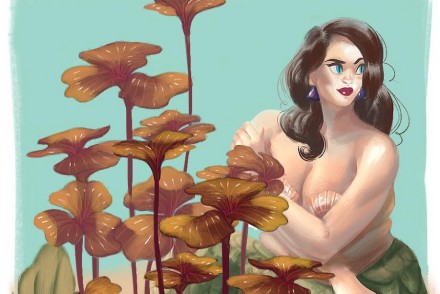
I started this little painting by keeping to a limited palette, of course if you have lava in your painting it means you’re not going to be doing a whole lot besides a limited palette! I went through a series of color shifts to see if my color were the most interesting for the composition. As you can see, other colors will work as well, but I like the orange violet the best.
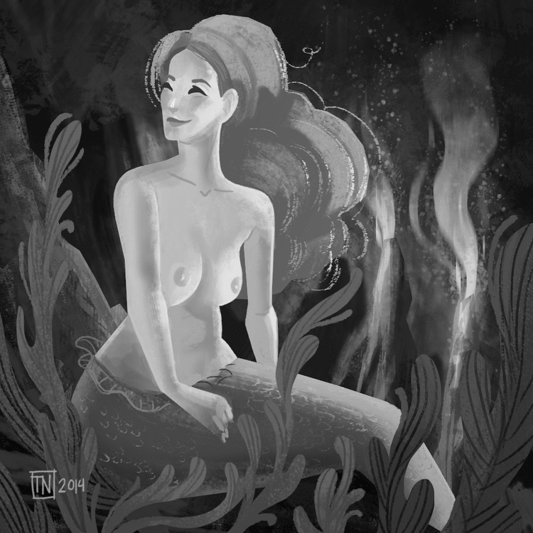
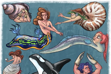
I also thought maybe line work fish would look cool, but it make the composition way to busy in my opinion.
<a href=”http://www.bloglovin.com/blog/12703387/?claim=nqtkchja3hv”>Follow my blog with Bloglovin</a>
No Comments